Technical analysis on Deriv’s platforms
Technical analysis ignores news items and economic data, focusing purely on price trends and volume. It primarily involves studying chart patterns, showing the trading history and statistics for whatever currency pair is being analysed. You would start with a basic price chart, which would show the stocks trading price in the past, and look for a trend or pattern that can help determine future pricing.
Price is king
Winning traders trade what they see, not what they think.
If the stock price goes to 60, 61, 65, 70, it is going up, and it doesn’t matter what the indicator or news says or what you THINK should be happening. The price tells you the truth and should always be obeyed. Many new traders lose large amounts of money trying to pick the top or a bottom. This is a risky strategy and not essential for success. Unless you have psychic powers, stick to a trading system and don’t guess. For example, as stated previously, Tesla (TSLA) by most metrics looks very overvalued, yet the price is moving higher, so it makes sense to stay with the trend.
Three posible states for stocks
A stock can only be in three states regarding price movement:
- Trend higher
- Sideways range
- Trend lower
Let’s explore each of these states in detail.
1. Trend higher
The Lows are becoming higher. The highs are also becoming higher.
In other words, whenever the market sells off, it rebounds at a higher price than the previous time. This is considered to be positive or bullish activity because market participants are willing to pay more than in the past.
In this case, we would want to buy (go long) the stock or index CFD.
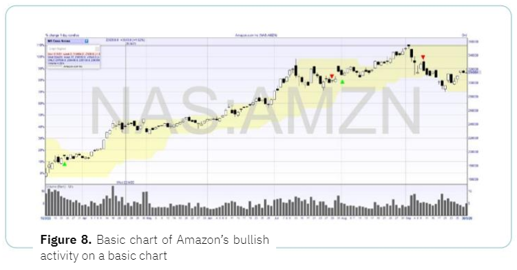
Figure 8. Basic chart of Amazon’s bullish activity on a basic chart
2. Sideways range
Prices can bounce between the two levels for a long period of time. At some stage, the equilibrium is broken, and a new trend or range is established. This state is often overlooked, but a stock can stay in a sideways range for weeks or even months. A sideways range is a case in which buyers and sellers are equally matched. In this case, price levels have been formed that attract buyers (or support) and sellers (or resistance).
We can buy a CFD at the bottom of the range, sell it at the top of the range, and keep repeating this. Of course, at some stage, a trading range will break and a new uptrend or downtrend will emerge.
Sideways range can be a very simple trading system, and you can, of course, replicate it on more than one stock or stock index. You can also manage your risk by placing a stop just outside of the range. If you look at the Amazon chart in Figure 9, you’ll see that it peaked on 3 September 2020 and then went sideways for the rest of 2020 between S2,948 and $3,440.
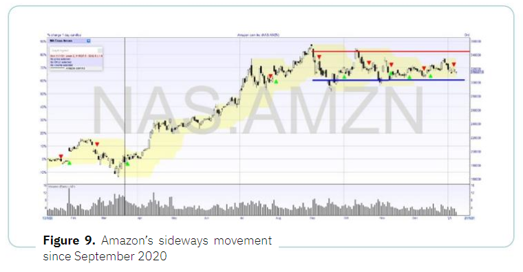
Figure 9. Amazon’s sideways movement since September 2020
3. Trend lower
In this state, the lows are becoming lower, and the highs are also becoming lower. In other words, whenever the stock or stock index sells off, it rebounds at a lower price than the previous time.
This is considered to be a negative or bearish activity because market participants are willing to pay less than in the past. The stock is losing strength. The type of trade you would look to make with Deriv during these market conditions is short selling down trades on CFDs.
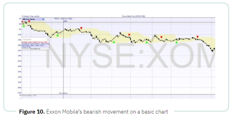
Figure 10. Exxon Mobile’s bearish movement on a basic chart
Time frames
Depending on which time frame you use in a chart, the trends and patterns will look very different. Many traders examine multiple time frames for the same stock, such as Apple (AAPL) in one-minute, one-hour, and one-day charts.
DMT5 offers comprehensive charts across different time frames, ranging from very short-term (one minute) to one-day bars, one week, and even one month. You can have multiple time frame charts open.
I would not look at a stock with a shorter time frame than 1 minute, as that becomes almost random. One-minute, one-hour, and one-day are popular time frames.
Chart formats
There are various types of charts that can be used to analyse CFDs. However, to keep things simple, we will look at the candlestick charts. Candlestick charts are said to have been developed in the 18th century by the legendary Japanese rice trader Homma Munehisa. The charts gave Homma and others an overview of open, high, low, and close market prices over a certain period. This method of charting prices proved to be particularly interesting and helpful due to its uncanny ability to display five data points at a time, instead of just one. The method was picked up by Charles Dow circa 1900 and remains in common use by today’s financial market traders.
Candlesticks are usually composed of the body, typically shaded in black or white illustrating the opening and closing trades, and the wick, consisting of an upper and lower shadow illustrating the highest and Lowest traded prices during the time interval represented.
If the asset has closed higher than it opened, the body is white. The opening price is at the bottom of the body. The closing price is at the top. If the asset has closed lower than it opened, the body is black. The opening price is at the top. The closing price is at the bottom. A candlestick need not have either a body or a wick. In the examples throughout this book, we have used red for a down candle instead of black, and green for an up candle instead of white.
Power tools for stock traders
This guide doesn’t aim to go into the hundreds of possible technical trading tools, patterns, and indicators, but the following can give you an understanding of the main tools available. This brief overview is designed to help you get started in trading via CFDs or digital options so that you can begin to build up your knowledge. Deriv and MT5 offer access to excellent complementary charts and tools with over 30 technical indicators, but we will stick to three of the main ones here.
It’s important to keep your trading system simple at the beginning. As you progress, you can add extra tools to refine your abilities further.
There are three main tools a trader can use: moving averages, Donchian channels, and relative strength index (RSI).
Moving averages
This tool has earned and saved me more money than any other. It’s hard to trace the precise origins of the moving average (MA), although this concept is often attributed to Richard Donchian. He was a great pioneer of systematic trading in the 1950s and ’60s. The methodologies that he developed over 40 years ago still serve as the basis of many complex systems used by the world’s best traders.
Let’s suppose that you need to work out a 10-day moving average of the following numbers: 10, 20, 30, 40, 50, 60, 70, 80, 90, 100.
You would add these figures and divide by 10 (i.e. the total number of items in the set), to arrive at an average of 55.
Now when tomorrow’s price comes in — let’s say 105 — you would remove the oldest number (10) and add 105 to the end of the series. The average of this set would now be 64.5.
Every charting software package incorporates the moving average, as it is one of the most fundamental aspects of trading. You will also find it on the various charts featured on the internet. You don’t need to worry about working it out manually on your own.
Deriv offers moving averages among its tools, and they are easy to add to any stock or index.
Moving averages can be calculated for any data series, including all sorts of different indicators associated with a particular currency (open, high, low, close, volume, etc.). To start, concentrate on the simple moving average. Whilst some have tried to be clever by deviating from this straightforward standard in various ways, it is best to stick with a simple approach, particularly as you first begin to trade. In software or on the internet, the simple moving average is often abbreviated as SMA.
There are five popular types of moving averages:
- Simple/arithmetic
- Exponential
- Variable
- Triangular
- Weighted
Applying moving averages to stock or index
Here’s the basic rule of thumb with moving averages in the context of a stock price: when looking at the relationship between time frames and moving averages, the choice of the period you select on the moving average indicator significantly impacts the results. I have found the 21-day period to be a good all-round moving average. The rationale behind this is there are around 21 trading days a month, once you take out weekends and holidays.
Moving average crossover system
We can have one or more moving averages on a chart at once. I personally like 2 moving averages with a slower (long-term) MA and a quicker (short-term) one. A buy and sell signal is given when the two cross over. So we could have a 21-day moving average and a 5-day moving average (one week). We will use 1-hour charts and a 20-period and 5-period MA, so that would be 20 hours and 5 hours. I have used 20 hours, but that could be 20 minutes or 20 days for a longer-term system. There is also nothing to stop stop you from experimenting with other time frames, such as using 10 hours.
The chart below shows daily candle charts with the 21-day (green line) and 5-day (purple line) moving averages. I have marked the cross-overs with arrows showing the buy and sell points.
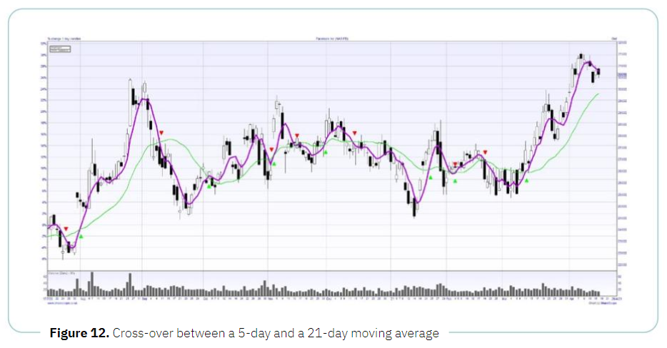
Figure 12. Cross-over between a 5-day and a 21-day moving average
Stock price channels: Donchian channels
The Donchian channel is an indicator used in market trading, developed by Richard Donchian. It is formed by taking the highest high and the lowest low for a set period, such as 20 days. The area between the high and the low is the Donchian channel for the period chosen. This tool is available within Deriv charts, with adjustable settings for the period length. Twenty days is the conventional time frame, which is why the Donchian channel is often referred to as the 20-day rule or the 4-week rule.
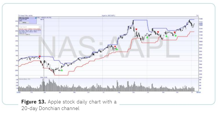
In this example, we see Apple (APPL) daily chart (each bar is one trading day) with a 20-day Donchian channel. We can see that the price was trending higher before. The current trade is long as the last signal is a buy when the price hits its 20-day high. We can trade this system long. Then, when we have a sell signal, we can close our long trade and open our short trade.
The basic trading system could be:
- Enter long when the price hits 20—day high Donchian channel
- Close sell when the price hits 20—day low Donchian channel
And then the reverse
- Enter short when the price hits 20—day low Donchian channel
- Close buy when the price hits 20—day high Donchian channel
A simple system like this can be programmed into MT5 or applied via DBot to automate trades. I have used the 20-day chart, but you could go with a 20-hour or 20-minute chart for a shorter-term system.
Whilst basic, this system has some powerful advantages:
- Winning trades are left to run.
- You have an exact exit strategy (no guessing).
- The system is rule-based.
- Your risk is always defined.
Even with more losing trades than winning ones, there’s a chance that you can still make money as long as the winning trades make more points than the losing ones. You can also profit from down moves as well as up.
Relative strength index (RSI)
The relative strength index (RSI) indicator measures a share’s performance against itself. It is often used to identify buying opportunities in market dips and selling opportunities in market rallies. The value of the RSI is always a number between 0 and 100. The indicator was developed and introduced into practice in 1978 by an American engineer J. Welles Wilder, a real estate developer and famous technical analyst. It is still widely in use.
How to use the RSI?
The chart on the next page shows an example of the Dow Jones Index (Wall Street 30), in which we can apply this tool to inform trading decisions. A low number (30 and below) indicates a more oversold market. A high value (70 and above) indicates a more overbought market. The higher and lower horizontal lines on the graph are at 30 and 70, i.e. the levels at which markets are often regarded as oversold or overbought. When the RSI moves to 70, it’s a good time to look at “Sell” (“short) trades. When we see the RSI down at 30, it’s a good time to look at “Buy” (long) trades. In this example, we can see the RSI is at 60, which is fairly high but not overbought, so the RSI is not providing a clear buy or sell signal. Thus, in this case, it would be best to hold off from placing a trade, until clearer signals appear. If we were already in the trade, we would remain long.
If we are using a CFD, we will look to buy (go long) when we see the RSI down at 30, and we would look to sell (go short) at 70 or over.
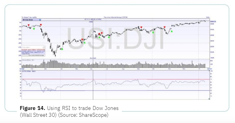
The 70/30 RSI and a 20-day lookback period are the most common settings; however, there is also another variation worth looking at:
Steady approach — 80/20
Let’s examine the smoothing period of 20, oversold level 20%, and overbought level 80%. Risk-averse investors set up the indicator in a way that will make the RSI less sensitive and therefore minimise the number of incorrect signals. With all systems, it’s always a trade-off between having too many signals, many of which will be false, or fewer, more accurate signals, but possibly delayed.
In MT5 charts, you can easily change the settings to any combination you wish. I have used ShareScope for some of my examples.
Trade with Relative strength index (RSI)
Please check Deriv official website or contact the customer support with regard to the latest information and more accurate details.
Deriv official website is here.
Please click "Introduction of Deriv", if you want to know the details and the company information of Deriv.


