Which MT4 chart type is the best to analyse market trend? - Bar, Line or Candlestick charts? Table of Contents
Which MT4 Chart is the best?
Technical analysis is mostly focused on the use of charts. To begin chart analysis, it is crucial to understand what types of charts can be used to predict market movements and how they are constructed. The three most popular types of charts are:
- Line charts
- Bar charts (OHLC)
- Candlestick charts
Download XTB MT4 trading platform for free
1. Line charts
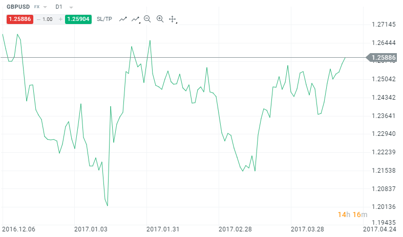
Line charts are by far the simplest form of charts when it comes to financial markets, used in the past by stock traders. They are based on the lines that are drawn from one closing price to the next closing price. Such a chart is an easy way to show the general movement of a price market over a specific period of time. Due to their simplicity, line charts also help to recognize technical patterns and are often preferred by beginners. If you are looking to get started in financial markets, practicing with line charts is a good place to start.
2. Bar charts
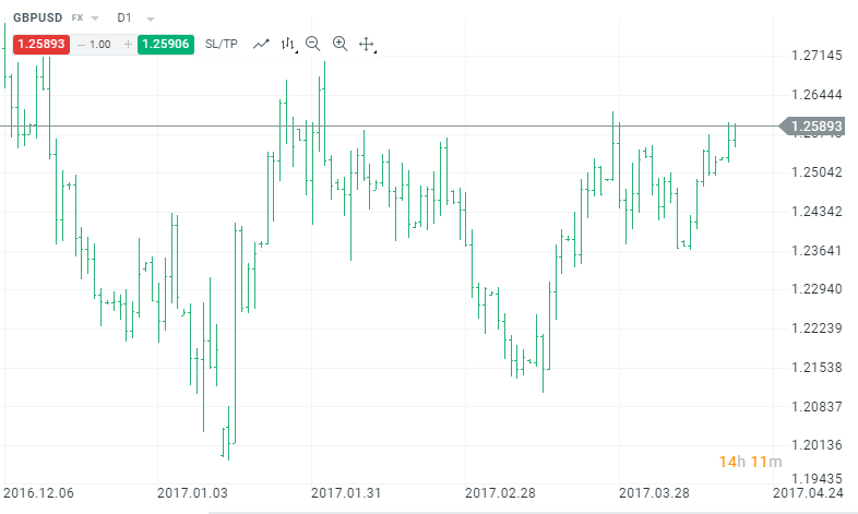
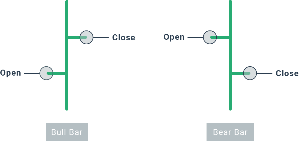
Unlike line charts that only provide the closing prices of an instrument, bar charts provide the opening and closing prices, as well as the highs and lows for that period. The lower part of the bar shows the lowest price traded for the chosen time period, while the upper part indicates the highest price that was paid. The entire bar represents the trading range for a specific period of time. The opening and closing prices are represented by the horizontal marks to the left and right of the vertical bar, respectively.
There are two types of bars that can appear on the chart. A common method of classifying vertical bars is to show the relationships between the opening and closing prices within a single time interval, either as bull (rise) or bear (fall), as seen below.
The bar charts present the data individually and show how the price has behaved during a specific period. Recognizing trading patterns can be a bit more complex compared to line charts and bar charts, but it will provide you with all the necessary information about a time interval.
3. Candlestick charts
Similar to bar charts, candlestick charts present the same information but are certainly more visually accessible. Similar to bars, candles reflect the period from high to low, with open and close levels. The highest price is indicated by an upper shadow, while the lowest is shown by the lower shadow. The longer the body is, the more intense the buying or selling pressure will be. In contrast, short body candles indicate little price movement and represent consolidation (a period when the market remains calm).

The only difference is the construction of the body. In bar charts, the open and close levels are illustrated by the horizontal markings on the left and right. In candles, it is the body (the middle) that shows whether it was a bullish candle (ascending) or a bearish (falling). Normally, if the body is black, it means that the price closed lower than the opening price. On the other hand, a white candle represents a bullish movement (the price closes higher than its opening). However, it is worth remembering that these colors vary across different platforms and can be adjusted on both the xStation 5 and MT4.
Compared to traditional bar charts, many traders find candlestick charts more attractive and easier to interpret. Each candle provides an easy way to interpret the picture of price action. Immediately a trader can compare the relationship between the open and close, as well as the highest price lowest. The relationship between the opening and closing is considered vital information and constitutes the essence of the candles.
See Candlestick charts of XTB MT4
Which chart type is the best for traders?
As you can see, there are three types of charts that are used by traders. Each of them has its own advantages and disadvantages. To become a successful entrepreneur you must use the one that suits you best. Beginners can start with line charts and basic trading patterns, while more advanced traders can use candles to develop their trading strategies. What’s more, other charts like Heikin-Ashi can also be found on XTB’s trading platforms.
Know how to define Support and Resistance Lines
Two common terms that you will see throughout your trading – particularly in technical analysis – are ‘support’ and ‘resistance’. But what do they mean and how do they apply to your trading?
1. Support Level
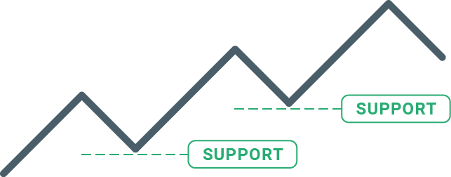
A support level is below the current price of an instrument and tends to be where falling prices find a support floor. This means that price is more likely to ‘bounce’ off this level rather than break through it. For example, if you notice that a market is having difficulty breaking below a specific level, that means that you have identified support.
On many occasions, support levels become psychological levels for traders. ‘The price of this market should not fall lower, so I will buy.’
2. Resistance Level
Resistance is above the current price of an instrument and acts as a price cap as they rise. Contrary to a support level, resistance levels mean that the price is more likely to fall at those levels. A general rule of thumb for resistance levels is that they tend to drop prices higher and act as a price ceiling. Essentially, they encourage traders to lock in their profits and attract sellers. “I don’t think the market is going to go higher, so I am going to close my position.

How to identify support and resistance levels?
There is a wide range of analytical tools and methods that help in identifying support and resistance levels:
- Previous highs and lows
- Candle patterns
- Moving averages
- Trend lines
- Bollinger Bands
- Fibonacci retracement
When support/resistance levels are broken, a breakthrough or rally usually takes place – until another support or resistance is encountered. For example, the EURUSD could find it difficult to break above 1.15. You could test this barrier two or three times before bouncing or breaking that level.
A Rebound is a situation when an asset rebounds from the level that was identified as resistance or support. In the example below, the WTI price encountered resistance at $ 55 per barrel. The price rallied a couple of times from the level and later retreated.

While a rally is more likely than a breakthrough, this would be a sign that the market may reverse trends at least in the short term.
A breakthrough is an important time in trading, as it usually leads to a rapid increase in volatility. As shown in the chart below, the pair has struggled to break below 1.35, but after it finally broke through, a quick move ensued.
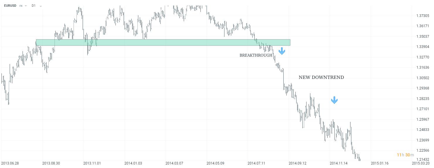
Also, after a support level is broken it becomes a new resistance level and when a resistance level is broken it becomes a support level.
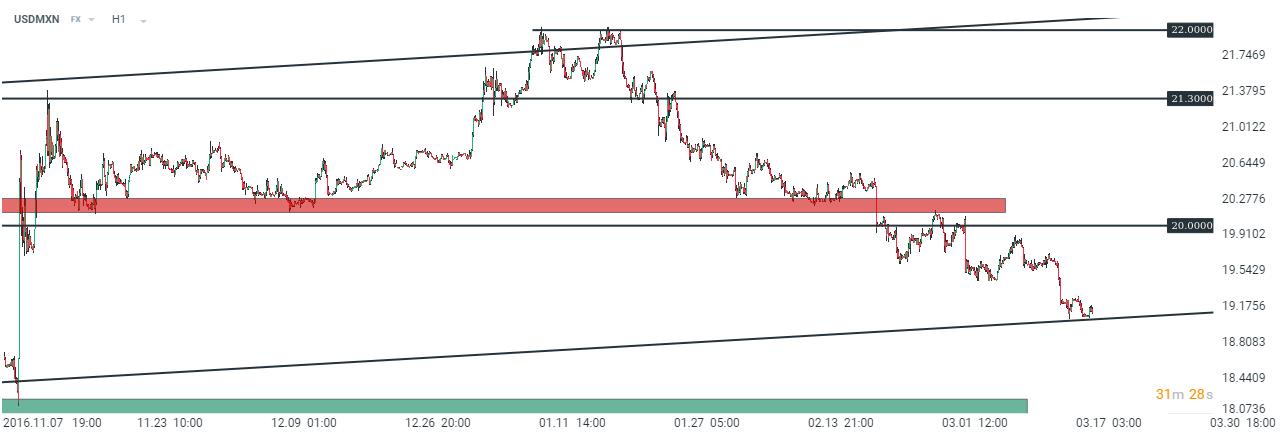
The 20.00 level was a crucial level for the USDMXN. After breaking above said level, the pair rose 2 additional figures and reached the all-time high at 22.00. However, a decline has started since then. USDMXN broke below 20.00, turning resistance into new support. That’s a typical situation worth looking for, as it offers a wealth of opportunities to join the trend. In such a situation, a trader could have sold the pair after breaking 20.00.
Open XTB Account for free – Trade over 2100 global markets
Please click "Introduction of XTB", if you want to know the details and the company information of XTB.


